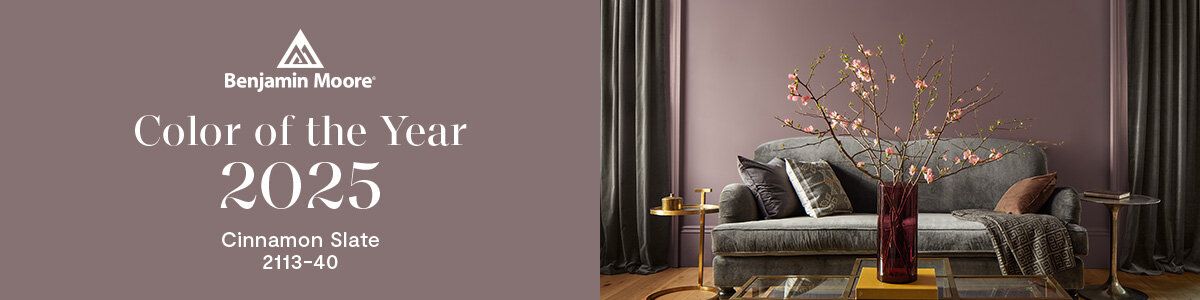
Color Drenching: Is This New Trend Worth the Hype?
Short answer: Absolutely.
What is Color Drenching?
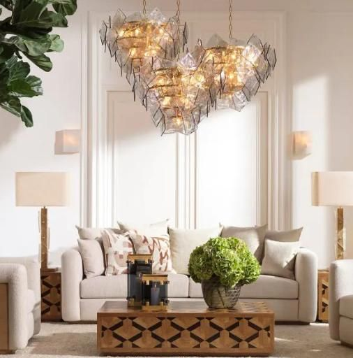
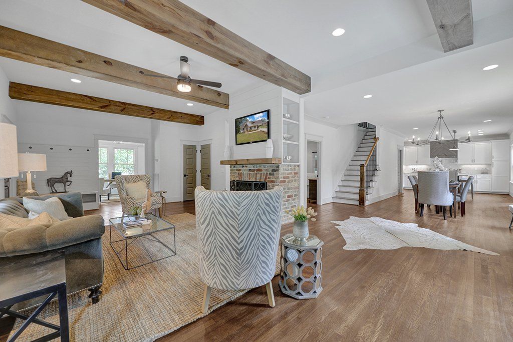
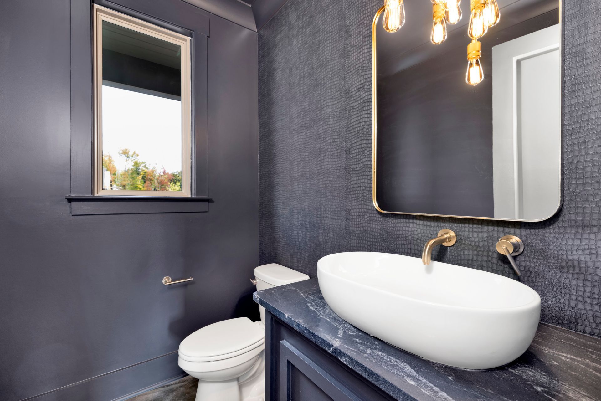
If you’ve been down the Pinterest rabbit hole lately—or even just scrolled Instagram once this week—you’ve seen it: walls and trim and sometimes even the ceiling painted the same color. It’s moody. It’s modern. It’s color drenching, and it’s making everyone second-guess their baseboards.
But is it actually worth the hype?
TLDR? Absolutely.
Long answer: Let’s talk about why it works, and why half-committing to this look is the biggest design mistake most people make.
Some Brief Color History
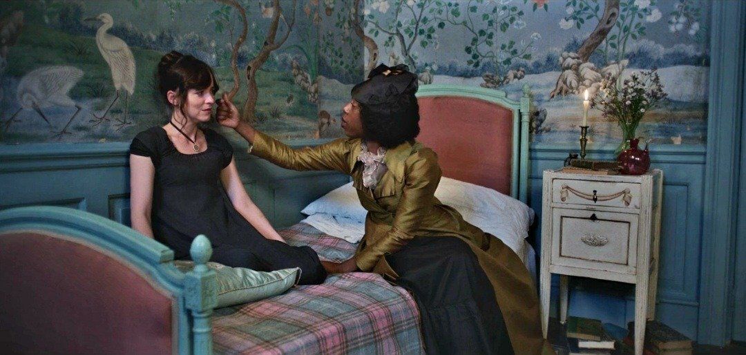
Color drenching might feel like a bold new rebellion against the era of gray walls and white trim, but if you've seen Bridgerton or any Jane Austen movie ever, you know that it actually echoes the layered maximalism of historic English interiors. In old English manor homes, the trim was rarely white—it was deep oxblood, forest green, ochre, or even black. These homes embraced saturation. They had wallpaper and painted moldings and dark ceilings. It was never just one feature wall; it was a full experience. Color was a way to show richness, taste, and intention. When paint was expensive and pigments were precious, using a lot of it said something about who you were.
Fast forward to the early 20th century and the rise of American minimalism—or as I like to call it, the Joanna Gaines era - color took a back seat. Suddenly, white paint and trim became the default, and color was something you “added” in small, polite doses. It all felt very builders grade to me. Your home told me nothing about you. It was all Ikea catalog Scandinavian or "resale value" generic. It made sense in a housing boom, where people were moving frequently and needed a home to be generic for the next buyer.
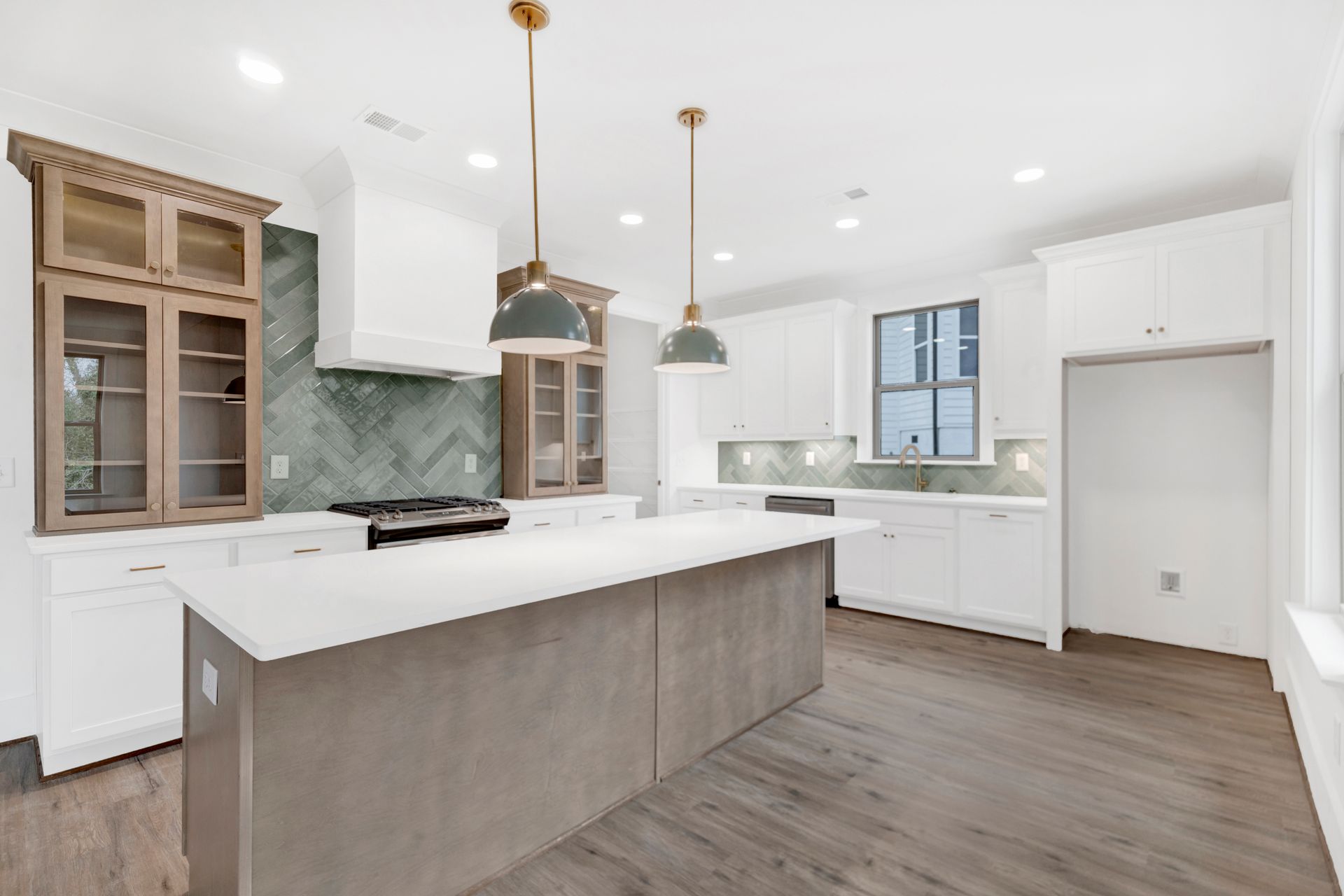
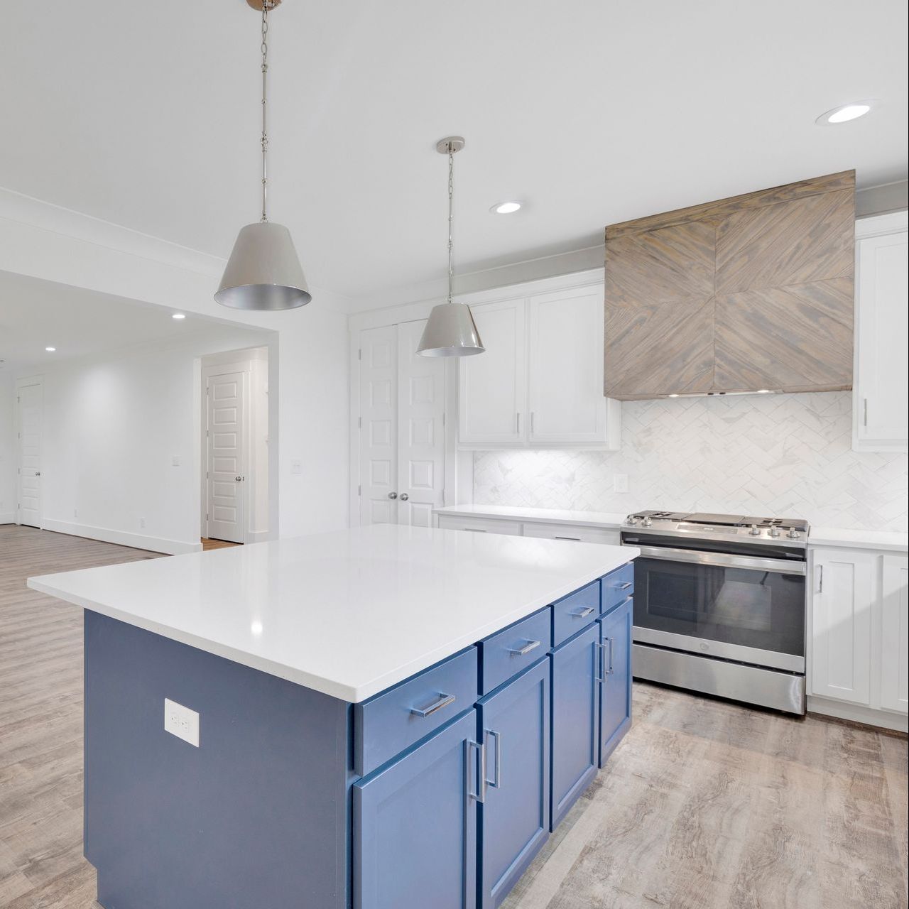
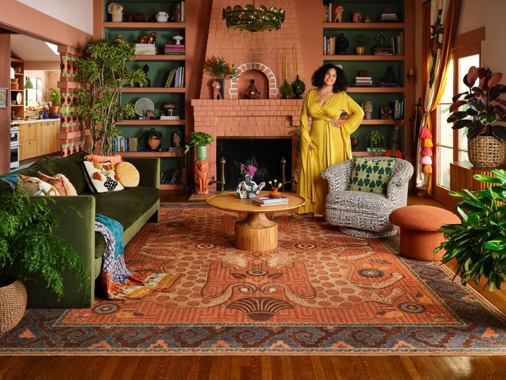
But now? Color is making a comeback, not just on walls, but everywhere—doors, ceilings, crown moldings, baseboards, cabinets. Folks are buying to stay for a while. And design is circling back to depth, to mood, to personality. And let's be real here - buyers see that too. If you have an intentional designed space, they will love it. Or hate it. But they will absolutely remember it over the 17 white houses they've seen.
This is where color drenching shines. It creates an enveloping, intentional feel. The space looks cohesive, curated, and much more expensive than it probably was. It erases visual noise. You don't have to add a ton of curated furniture to make it work, the paint does the heavy lifting, so you can go full on maximalist or just let the paint speak. It makes a room feel taller, calmer, more dramatic—depending on your chosen shade. But here’s the kicker: if you only go halfway, you don’t get the magic.
Where did this trend come from? Will it last?
I'm going to give credit to the talented Justina Blakeney, who published a book called Jungalow in the middle of the minimalist heyday. She boldly went where nobody else was going, and infused spaces with much needed color and personality in a time when people were actively subtracting it from their spaces. I instantly fell in love, but I wasn't alone - Target picked up her line (you know it as Opalhouse) followed quickly by Ruggable. You can now get her wallpaper too!
Justina showed herself in her design, and inspired us to do so as well.
Most people fear committing to full color because they’re afraid they’ll hate it. So they do a feature wall. Or just paint the walls and leave the trim white. Or skip the ceiling. The result? It looks fine. Not bad. Not bold. Just...meh. That’s the real design mistake—playing it so safe you end up with a space you feel lukewarm about. And nobody spends $80/gallon on designer paint to feel lukewarm.
So will the trend last? Yes—and longer than you think. This isn’t about a specific color; it’s about confidence and cohesion. That’s always in style. Even better? Most people repaint every 7–10 years anyway. If you commit to a rich navy bedroom or a clay-toned living room now, you’ll probably be ready for a refresh by the time this trend naturally fades—if it ever truly does. (And if you have kids? Well, it's harder to see little scuffs and handprints on a colored wall than a white one, and I am a form + function girlie, so you know I love that functionality for parents!)
How to choose the right color
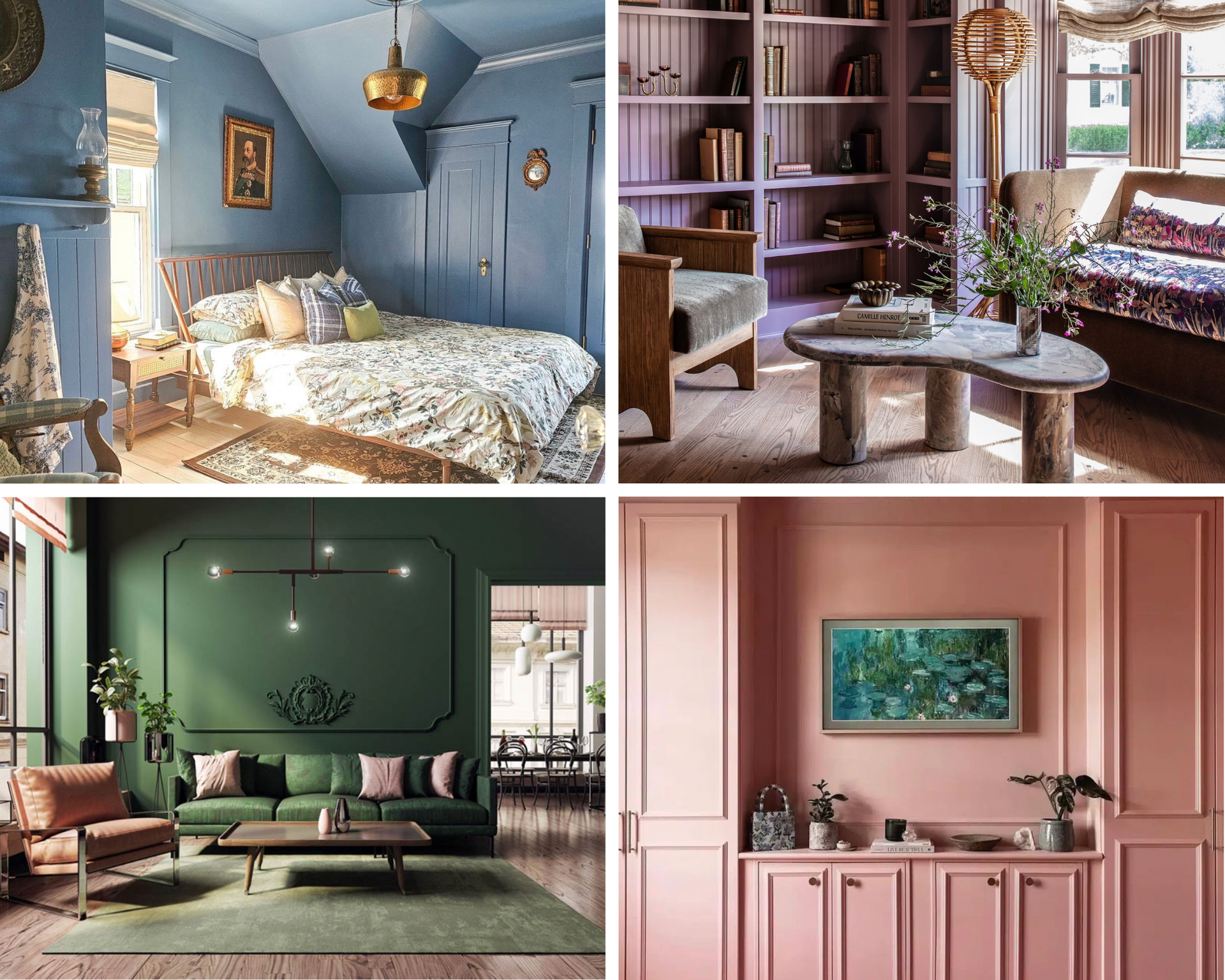
Choosing the right color for a color-drenched space isn’t just about what looks good on a paint chip—it’s about how that color behaves in your specific room, with your specific light, at different times of day. A rich navy might feel bold and cozy in a north-facing bedroom, but lean cold and stark in a bright, south-facing space. Warm clay tones, soft olives, smoky charcoals—each carries a mood, and the only way to know if it fits is to live with it for a bit.
That’s where swatching comes in. Skip the tiny paint chip and go big. Paint large swatches (think at least 18"x18") directly on the wall—or better yet, on foam boards you can move around the room. Check them in morning light, afternoon sun, lamplight, and shadows. Tape the swatch over your trim, your doors, even your ceiling if you’re going all in. This step isn’t extra—it’s essential. You’re not just picking a color; you’re picking an atmosphere. Let it prove itself before you commit.
Undertones are the sneaky little ingredients in every paint color that make or break a room—and most people don’t notice them until it’s too late. You might think you’re choosing a soft gray, but in your space, it suddenly looks lavender. Or that perfect beige? Turns peach at sunset. That’s the undertone talking. Every paint color has a dominant hue (what you think you see) and a subtle undertone that shows up depending on the lighting, surrounding colors, and even your flooring.
This matters especially when you're color drenching, because you're not just painting one wall—you’re committing to a whole vibe. A blue with a green undertone might feel spa-like and serene. A blue with a purple undertone could go regal and dramatic. Neither is wrong, but one might clash hard with your tile or sofa. When you swatch, don’t just look at the color—look at what it does near your wood tones, your fabrics, and your floors. If the undertone doesn’t play nicely, trust that instinct. The wrong undertone can make even the most beautifully painted room feel just slightly... off.
Should You Do It?
If you’re thinking about painting your trim the same color as your walls, stop thinking and start planning. Go all in. Don’t just dip a toe in the paint can—dive in. Color drenching isn’t about being trendy; it’s about being intentional. It’s about choosing to create a space that feels layered, thoughtful, and unmistakably yours.
And here’s the good news: you don’t have to figure it all out alone. Working with a custom home builder that offers start-to-finish service—including interior design—means you get expert guidance on everything from color selection to undertone compatibility to lighting impact. A good design team will help you swatch smart, avoid costly mistakes, and create a space that feels as beautiful on day one as it does five years from now. When you’re building or remodeling a home, every detail matters—and that includes the paint.
Because the real risk isn’t doing too much.
It’s doing
too little… and walking into your finished space wishing you’d been brave enough to go all the way.